5 Tips for Designing a Better Beer Label
You’ve sourced all the best ingredients for an upcoming brew. You’ve trialed and dialed your recipe. But have you thought about how you want the label to look? And what do you want consumers to know about the beer inside the package? Navigating the ins and outs of label design can raise a lot of questions. For help answering these inquiries and others, we’re turning over the BSG Blog to CanCraft’s Senior Graphic Designer Dylan Upper. Take it away, Dylan!
Tip 1: Tell a Story
Consider incorporating storytelling elements into the label design. This could be a brief description of the beer’s inspiration, an interesting anecdote related to the beer style, or an illustration that tells a visual story. Authenticity goes a long way toward building trust and loyalty, and engaging elements like these provide visual interest that will help your design stand out.
Tip 2: Know Your Target Audience
Think about your audience and what they’re going to find appealing and attractive. Always keep in mind that packaging is a visual representation of the liquid inside. The packaging and label for a barrel-aged stout, for example, should have a very different appearance than one for a Mexican-style lager.
Tip 3: Maximize the Medium
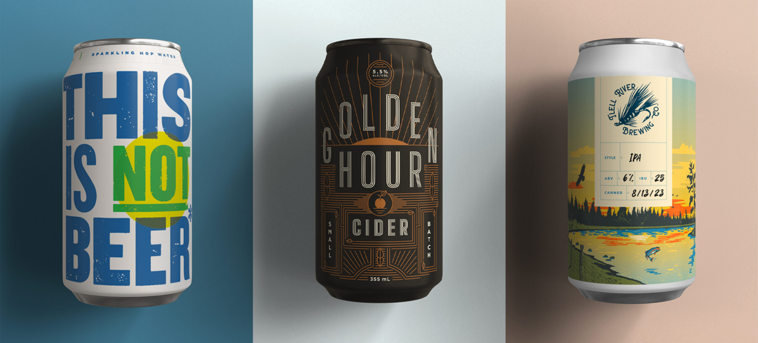
From shrink-sleeved to PSLs or printed to digital, each package presents its own opportunities and challenges. Printed cans look great but can be limiting in terms of color and artwork complexity. Shrink-sleeved labels offer unique printing decorations such as raised varnish and metallic finishes, but they come with the drawback of a plastic wrap. Knowing what is possible from a print perspective will only help to elevate your can design.
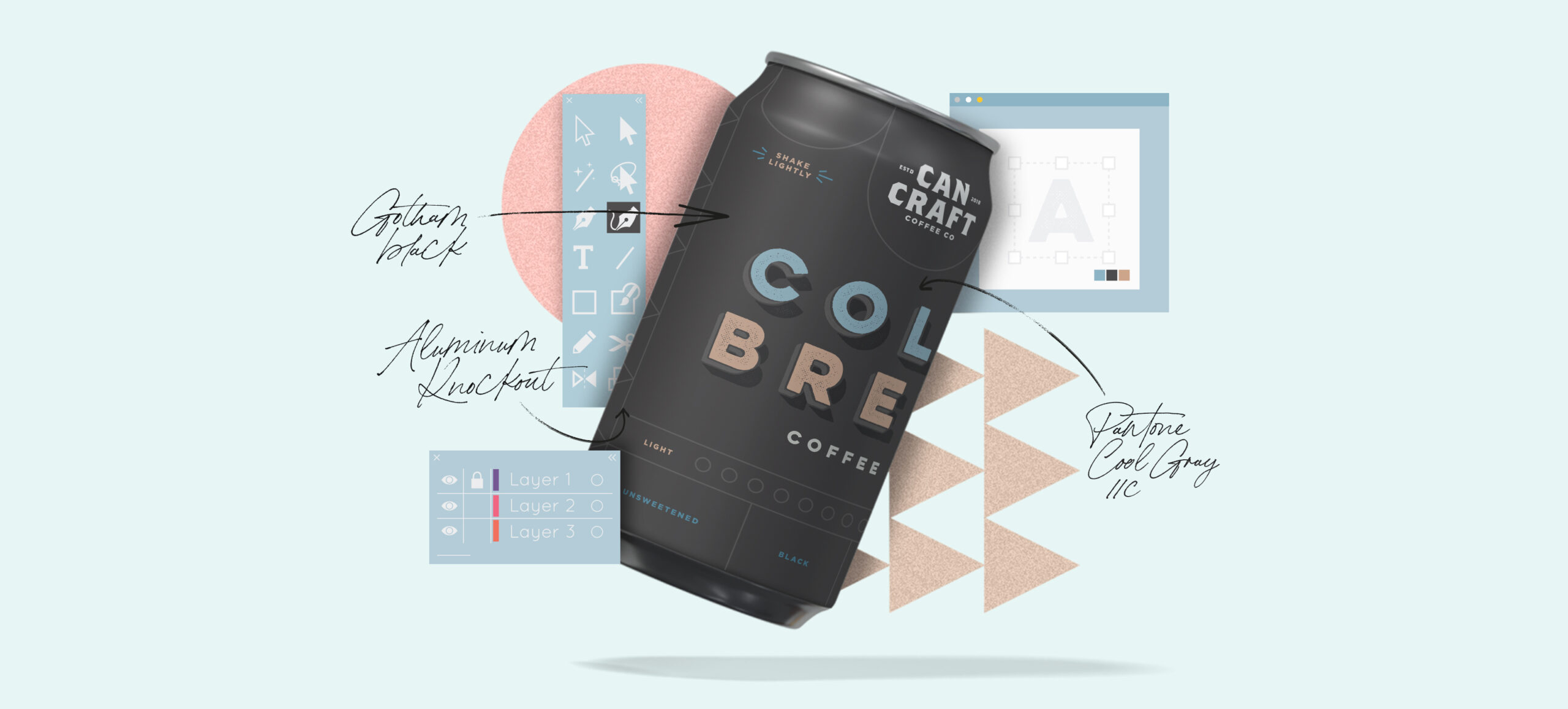
Tip 4: Design Systems are Cool and Cohesive
Whether you’re offering seasonal, one-off, or year-round beers, it’s important to consider how your entire product offering will fit together. One solution is by incorporating a design system; this is a set of guidelines, rules, and assets that establish consistency and coherence. Your system will encompass the logo, color palette, typography, and other visual elements that define the brand’s identity and contribute to a recognizable look and feel.
Tip 5: Form Follows Function
Have you ever been drawn to a particular label, only to struggle to determine the actual beer style or ABV? While a label design should be visually attractive and engaging, it must communicate the product’s key information in a clear and concise manner. In other words, make sure your consumers know where to look to determine that Pegasus Astronaut Rainbow Rocket is a DIPA with an ABV of 8%.
To learn more about designing a better beer label or to book a consultation, visit https://cancraftsolutions.com/.